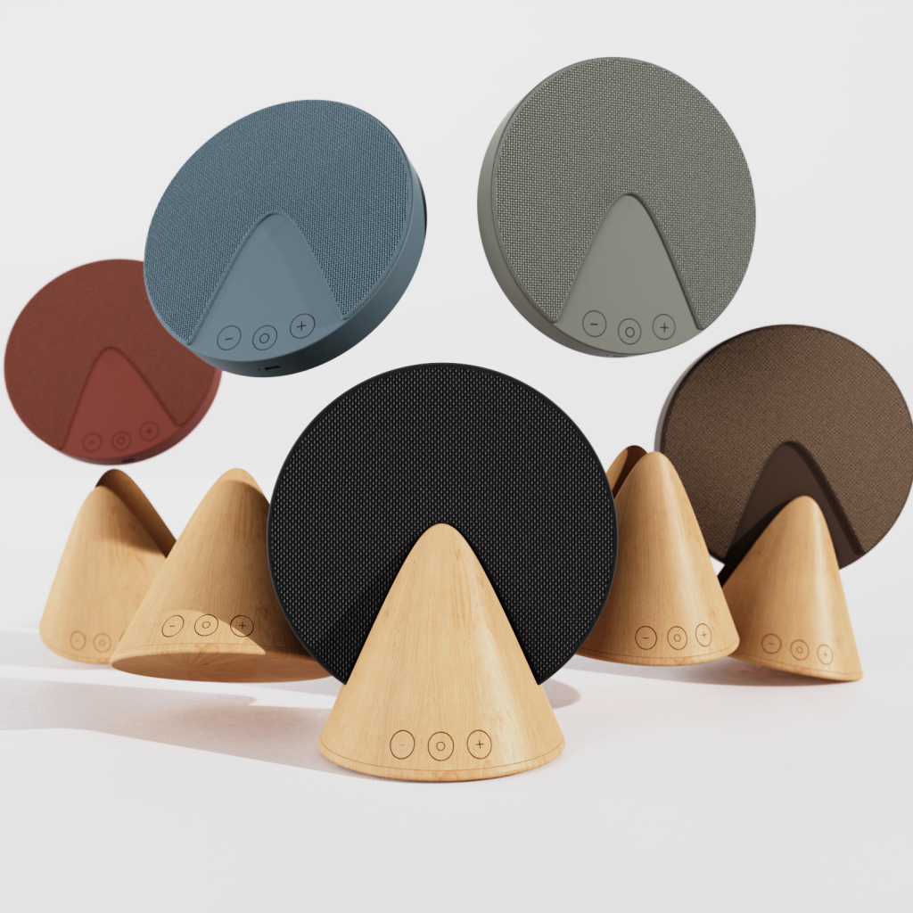
Composition Tips for Product Rendering
Why composition is so important while shooting your product?
The goal of composition in product rendering is to bring the viewer’s attention to your design. A well-composed product render not only is useful to visualize the aesthetics of your design but also helps to understand how it works.
In this tutorial, I will give you some basic tips about product composition to make your renders stand out.
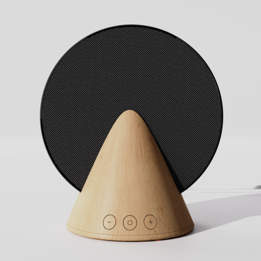
1. Use Front and Central Placement to Highlight the Product
Using a frontal camera and placing your product in the centre of the image helps to draw the viewer’s attention straight to your product without any distractions. This approach is especially effective for products with unique shapes or features that you want to highlight.
Use negative space around your object to release visual tension on your scene. By leaving empty space around your product, you create a visual balance that draws the viewer’s eye directly to your product. Negative space is used to convey a sense of calm and simplicity, which can be especially effective for minimalist products.
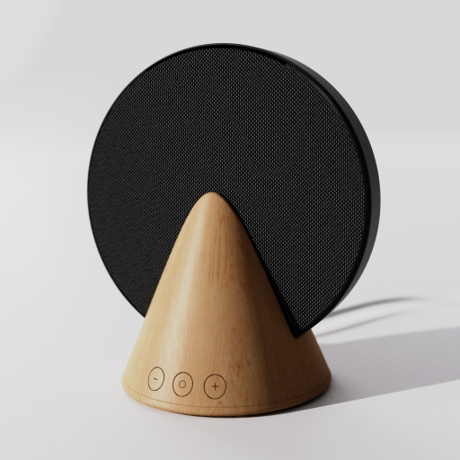
2. Choose a Camera Angle That Showcase the Best Features of the Product
Choosing the right angle to showcase your product can be critical in creating a compelling product image. By placing your camera at an angle between 25 to 75 degrees, you can show multiple sides of your product while also providing additional details. This approach is particularly effective for products with unique or intricate details that you want to highlight.
One popular angle that is commonly used is the 45-degree downward camera angle. This angle is similar to how we look at objects on tables and countertops, making the scene feel more realistic and relatable to the viewer. It also allows you to showcase the top and front of the product simultaneously, making it easier for the viewer to see and appreciate all of its unique features.
Ultimately, the angle you choose should be based on the unique features and benefits of your product and the message you want to convey to your audience. By experimenting with different angles, you can find the perfect angle to showcase your product and create an image that is both visually appealing and effective at communicating your message.
3. Enhance Your Product Composition with the Rule of Odds
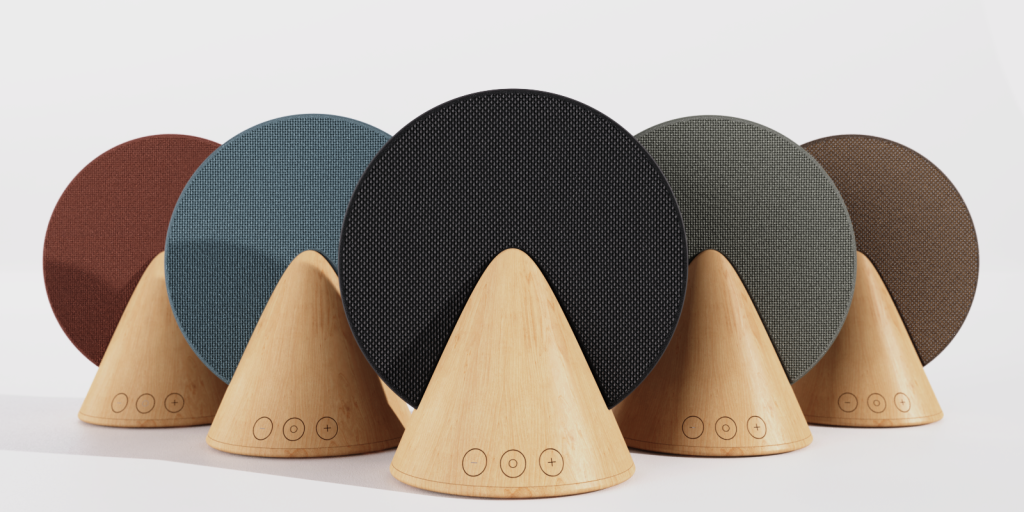
The rule of odds is a classic composition principle that can add a sense of balance and harmony to your product rendering. When you have an even number of objects in a scene, it can feel static and uninteresting to the viewer. However, using an odd number of objects creates a sense of visual tension and energy, making the scene more dynamic and engaging.
When shooting several variations of your product, using an odd number of them, such as 3 or 5, is a popular approach that can help to make your shot more exciting. This technique also works well when featuring a collection of products or showcasing multiple items within a scene.
If you only want to showcase one product, you can still use the rule of odds by adding other related items to the scene. For example, if you are rendering a coffee mug, you could add a bag of coffee beans or a coffee pot to the background to add interest and context to the shot. However, it’s important to be mindful of clutter and visual distractions when using this technique. You want to make sure that the additional items in the scene complement and enhance the product you are featuring, rather than competing for attention.
4. Apply the Rule of Thirds to Make the Composition More Appealing
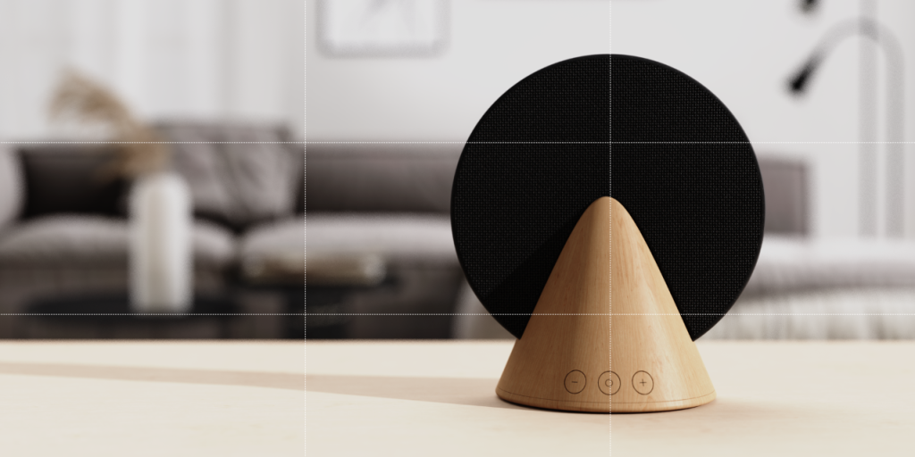
The rule of thirds is a well-known rule that divides an image into nine equal components with four gridlines: 2 horizontally and 2 vertically. It is based on the idea that placing the subject of a photo in the center of the frame can result in a static and uninteresting composition. Instead, the subject should be positioned along the points where the horizontal and vertical lines of the grid intersect, which are created when the frame is divided into three equal columns and rows.
By following the rule of thirds, you can create a more engaging and dynamic product image that draws the viewer’s attention to the subject in a more compelling way. By avoiding placing the product in the center of the frame, the rule of thirds encourages the viewer’s eyes to explore the image and take in all its elements, resulting in a more exciting and visually appealing composition. So, the next time you’re taking product photos, consider using the rule of thirds to create images that are both engaging and effective.
5. Showcase an Interesting Feature of the Product
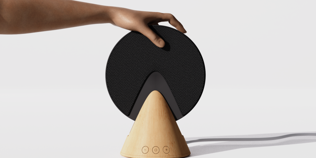
When taking product images, it’s important to showcase what makes your design unique and different from others on the market. One effective way to do this is to highlight the key features and functionalities of your product in a single shot. As the saying goes, “a picture is worth a thousand words,” so the image should communicate clearly and quickly how your design works and what sets it apart.
To achieve this, you may want to consider using different angles and perspectives to capture the details of your product. For example, if your product has a unique texture or shape, you can focus on these aspects to create a visually appealing image that stands out from the competition. You can also use lighting and color to emphasize specific elements of your product, drawing attention to the details that make it special.
6. Capture Your Product from a Top-Down View
Shooting your product from a top-down perspective can also provide a unique and interesting point of view that can make your product look more exciting and visually appealing. This perspective can help highlight the shape, texture, and features of your product in a way that other angles may not be able to achieve.
You can intensify the effect of this shot by using an out-of-focus background. By fixing the focus point on your product and using a low f-stop, you can blur the background and create a more polished and professional look.

I hope you find this article useful and remember...
These tips can help you find the best composition but you have to keep in mind that you need a different approach to every product. Don’t be afraid of combining these rules to create a composition that makes your product look the best!
